The art of remix album covers
Remix albums are a perhaps not often talked about part of music releasing, but they are very common, and serve to group together and release remixes, usually from a myriad of artists (but not always) in one release.
Since remix albums are, well, albums, they need cover art. I wanted to share some examples I’ve seen of this here, because I think they generally fall into 3 or so camps.
Camp 1: the pragmatic
Many releases don’t really put much thought into remix albums - the main event is the original release, and perhaps there isn’t much point in paying for a designer to design something new.
This is fully understandable, and the results come out as pretty easy to tie down to the original albums.
Here’s an example - A Moment Apart by ODESZA.
by ODESZA
The discreet REMIXES text in the top right corner is discreet, and gets the job done, but does not draw attention to itself and is not particularly flashy.
That said, the design is quite tasteful, and that is to be appreciated.
Camp 2: the delightful rework
This set of remix album covers is what drove me to write this article - I think that there it true beauty to be had in these covers.
The designers are playing off of the design decisions that made the original cover work, but putting a different spin on it, and keeping in theme.
where’s the drop?
Perhaps my favourite example of this I’ve found is where’s the drop by deadmau5. This is the legendary electronic producer’s only orchestal album, but a remix album was released to scratch that itch, and I think its design is both clever and funny.

by deadmau5
The edit is actually impressively simple when you look closely, but the album art very closely matches the element of humour being shown in both the original and remix album’s titles.
The cracks are also a nice touch.
Worlds
Another excellent example of this is Porter Robinson’s Worlds, which as its cover centerpiece features this hand with a cube.
The remix album cover does a couple of things here - first, it flips the colour scheme of the background from pink clouds on blue to blue clouds on pink.
Second, the purple hand holding the cube (almost with a sense of optimism or celebration?) is swapped for two hands held together as if depressed, in a less vibrant blue. The cube is left to hover above.
The flipping of the colours of the background also matches the flipping of hand colour.

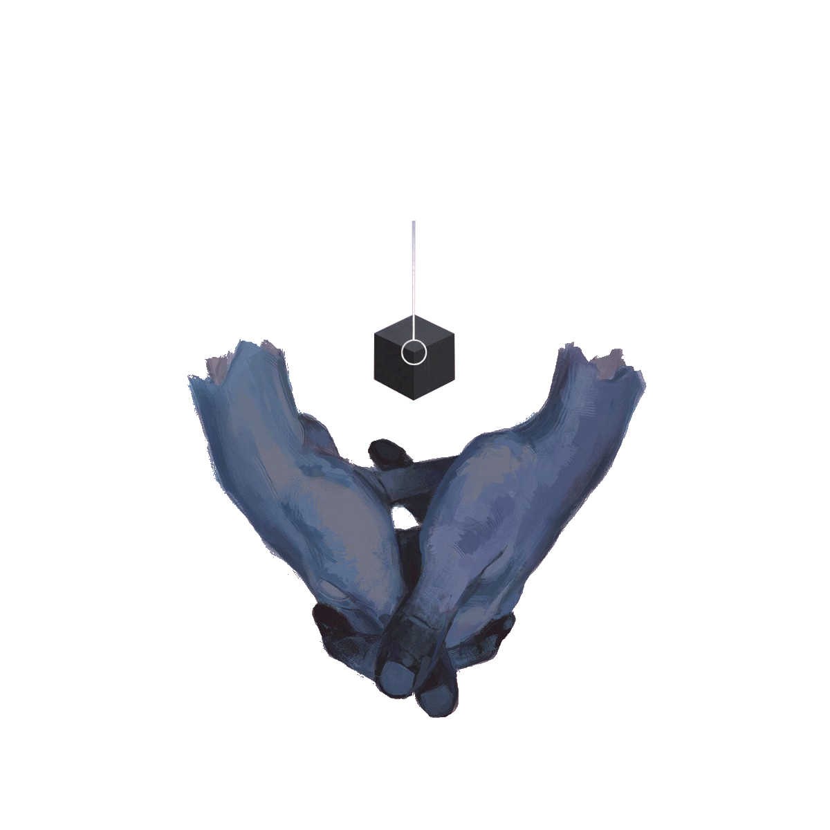
by Porter Robinson
This is a key change to the album cover, yet its instantly recognisable as Worlds, despite the core visual element being different.
The Mindsweep
I have one more example I want to show off for this - The Mindsweep by Enter Shikari.
The Mindsweep has a very busy cover, but the main things to take away from it are:
- blue head
- human head outline
- band’s logo in the middle
- facing left
Now look at the remixed album. The H references Hospital Records, but now pay attention to that list from before:
- red head
- skull outline
- band logo remains in the middle
- facing right
Also, just like worlds (and where’s the drop?), this cover is recognisable as being The Mindsweep, even with so much changed.
by Enter Shikari
Camp 3: the creative
Two types of design fall into here for me, the art that tried to work off the original and ran with it for a little too long, and the art that isn’t actually related at all.
Pink Floyd
Two Pink Flyod albums (Animals and A Momentary Lapse Of Reason) got remixed in 2018 and 2019 respectively, and the album covers were entirely overhauled.
These albums covers are also animated, which is fun!
by Pink Floyd
There’s a LOT to unpack here, so let’s dig in!
First of all, notice the retaining of the factory and the insanely iconic pig in Animals. However the factory is now covered in scaffolding, and there appears to be a modern building.
Also of course, the moving clouds and the colourful light trails - presumably to evoke the bustle of the train tracks.
Also, while the time of day seems similar, the cover is way less warm.
by Pink Floyd
Now onto lapse. There are much less non-animated changes to unpick here. Most notable is the plane, which was in the original, but now comes right out into your face.
The photographs are almost the same composition, but its clearly a different photograph, with different lighting, and with the tide further in.
The band member sat on the bed now comes and goes, and nurses tend to the side of others.
The waves crash in, and the sky fluctuates between a daytime blue and a nighttime purple similar to the original.
I personally find this cover very pleasing to look at, much more so than the Animals remix album.
REMXNG
REMXNG is a series of albums from clipping., featuring remixes of their previous work.
As they are from all over, they don’t actully use the art from any of their albums. Instead, they simulate the look of a vinyl record, and I think its delightful.
As of writing this, there are 4 of them, but heres just the first two.
by clipping.
Conclusion
I, uh, don’t really know how to end this off really.
Look at the pretty album art and see how the clever designer made the remix album cool too or some crap like that I guess.
Hopefully I’m not the only one who finds the way cover art is remixed along with the music kind of cool and beautiful.
Hope to see you back again soon.
— Yellowsink.